This post is part of the River Pond Quilt Along. You can find more info and the schedule HERE. While this content is directed toward the River Pond QAL, the same concepts can be applied to any quilt that you are making.
You can purchase the River Pond pattern HERE.
Homework Check-in
How did coloring go? Were you able to come up with some designs that you like? The more you colored, were you surprised by the different variations you found? How did you feel about the process?
I'd love to hear your thoughts about the process! Leave your thoughts in the comments below and let me know.
Picking Fabrics
Now that you’ve decided on a color scheme and have figured out the color placement, let’s take our coloring page to our fabric stash and pick some fabrics.
Quick Story Time...
When I first started using the coloring pages it was SCARY! It’s so hard to convert colored pencil to fabric. I remember it taking me a long time, and having lots of “I don’t think this is going to look good” moments during the entire quilting process.
If you have those moments – DON’T STRESS! It’s normal!
My husband asked me the other day as I was coloring a quilt idea, “how do you know if that will look good in fabric?”
I thought about it for a moment and replied, “because I’ve done this so many times, I just know.”
It’s like when you can speak two languages – they are so different but they both make sense and you know what one phrase means in the other language, even though it’s so different. I’ve done this so much, I now know the translation of colored pencil to fabric. There are a few rules or principles to learn, but once you figure those out, it’s a lot of fun!
Color & Design: https://fromblankpages.com/tutorial-color-design/
Fabric & Color: https://fromblankpages.com/tutorial-color-fabric/
My Process
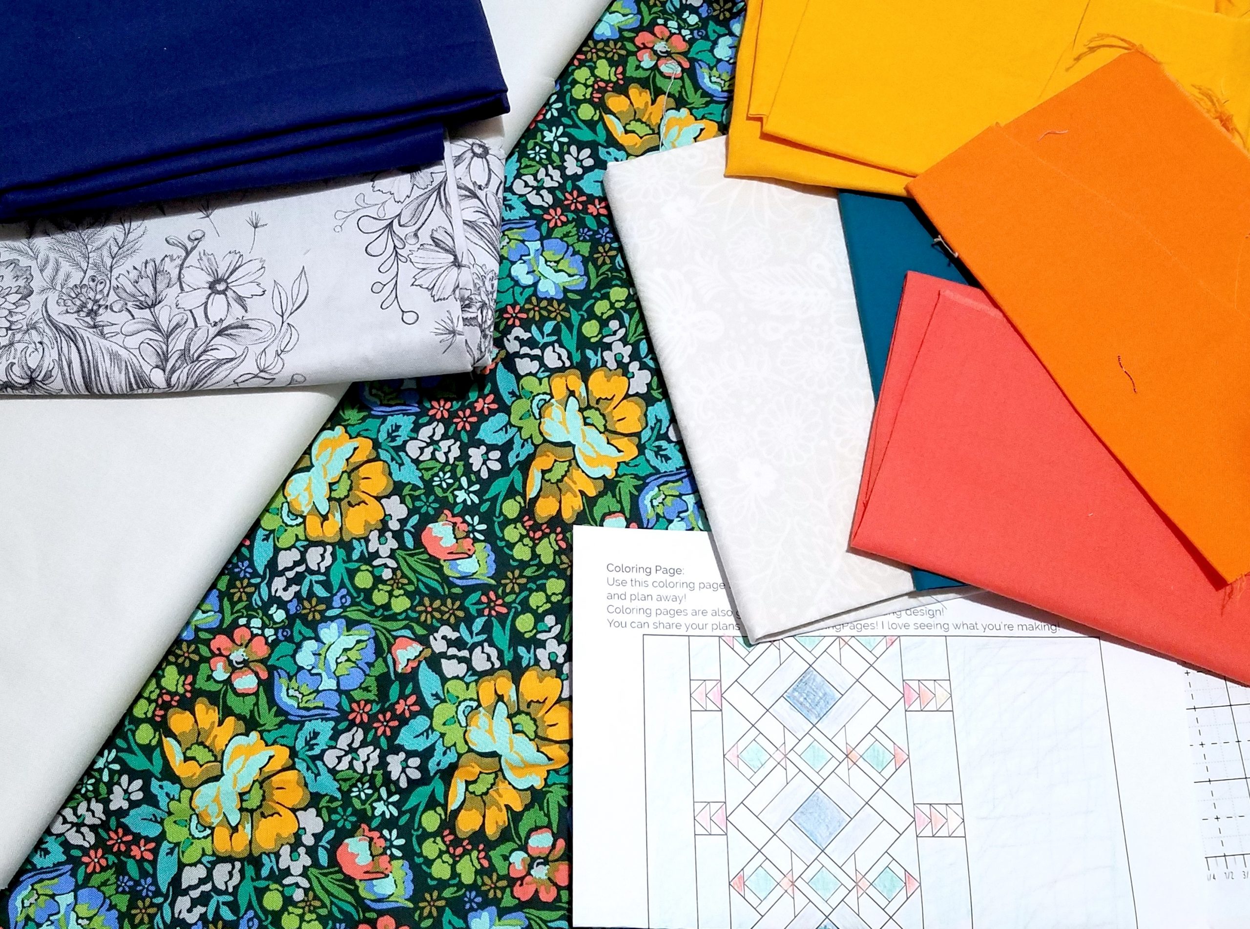
For my quilt I really wanted to use some fabric that I had on hand. I had just enough of this Anna Maria Horner print, and thought it would be a fun experiment to make this quilt with a dark background. So when I was coloring my coloring pages, I started with the background fabric.
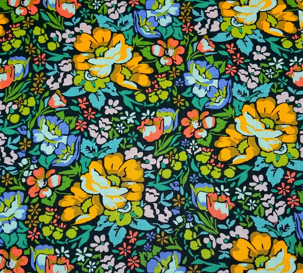
Next I pulled some colors from the background fabric to use in the rest of the quilt. I wanted some colors to really pop – so I tried some oranges. But I also didn’t want the quilt to be crazy, so I also decided to also add some greens and whites to help keep it kind of calm and neutral.
Here are my coloring pages. You can see that I tried lots of different ideas on one page until I found one that I thought would work, then I colored another page more of the design so I could see more clearly if I really liked it or not.
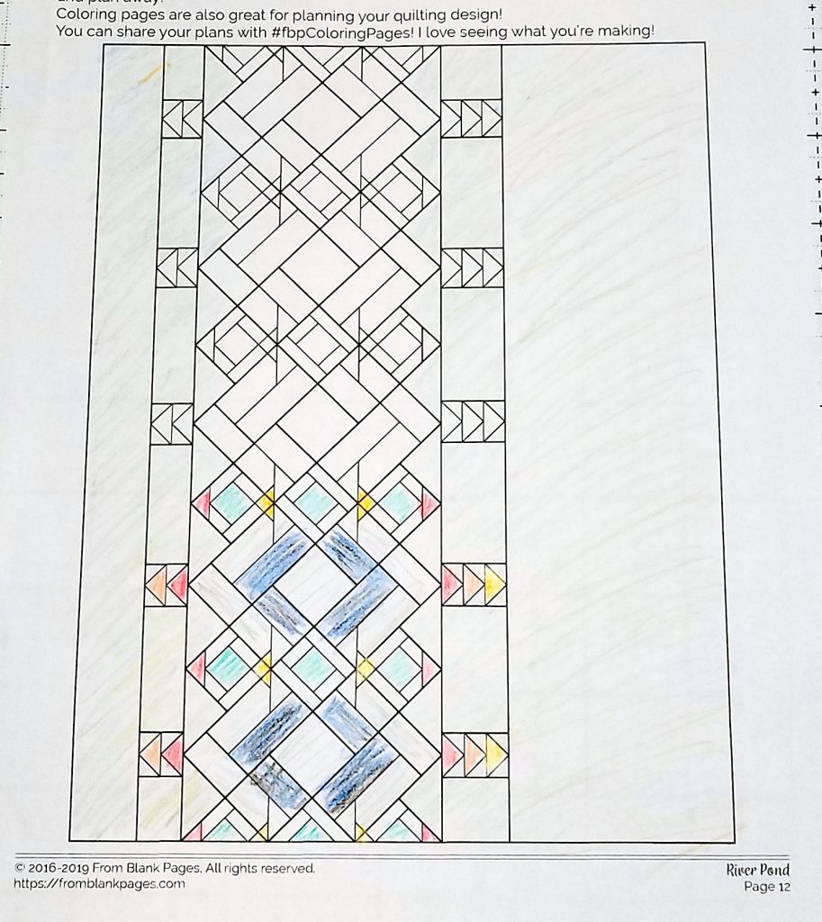
Here’s my first coloring page where I started coloring a design but changed my mind so I started over.
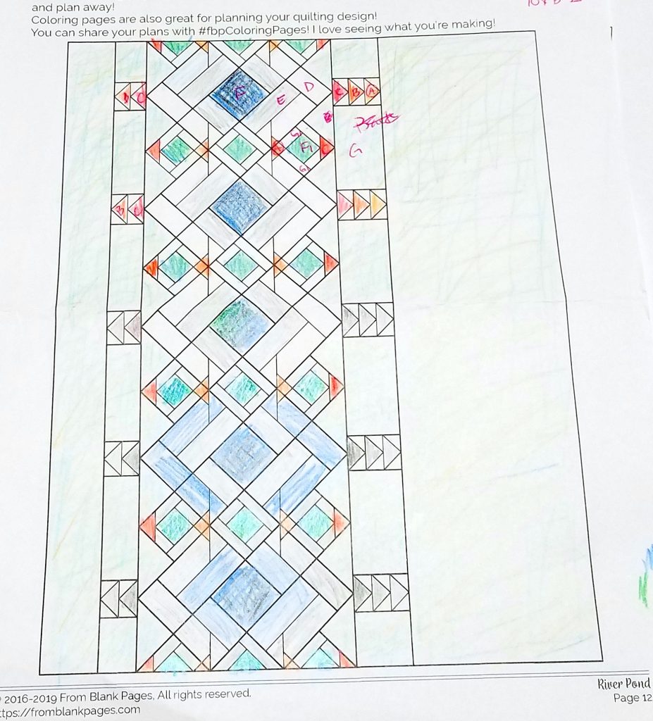
Here’s my second page where I actually colored a lot of designs as I continued to fine tune what I wanted my block to look like. I must have started from the bottom because the final design is at the top.
Once I had a set design and knew the colors I wanted to use I pulled my fabrics. I used a lot of solids since my background fabric is pretty busy – I didn’t want them to compete or lessen the design of the actual quilt.
Mixing prints and solids is another great way to add contrast, which I didn’t discuss in the links I shared above.
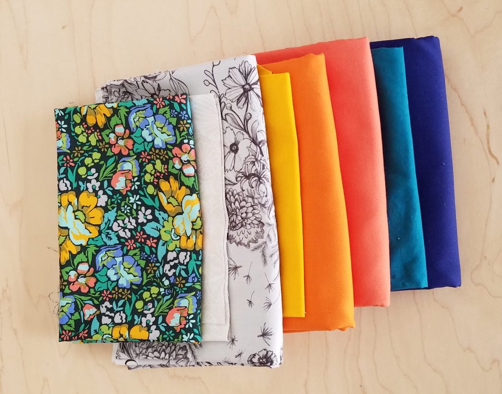
Here are my fabrics.
As you can see, my design varies from the pattern, so I’ll need to make adjustments to the cutting instructions. If you’re in that boat too, I’ll give some tips for that on Wednesday.
Homework
- Finalize your plan and colors
- Pick your fabrics
As you use your coloring page as a reference, ask yourself,
- For the design I want, do these have enough contrast in value? in color?
- If you’re using all prints, will these prints distract from the design or help emphasize the design? Will the prints blend together? or is there enough contrast between them?
- Sometimes a large scale print is deceiving when it’ll be used in a small space. If using a large scale print for small sections, will this work in small portions? (large scale prints work great in larger areas!)
REMEMBER there is not right or wrong! No good or bad design (ok, maybe not so pretty. lol.)
But seriously, if you like the design, then that’s the purpose of this! We all have different styles, different tastes, and this is not about making something that everyone else will love. (because you can’t please everyone anyway, that’s impossible!) It’s about making something YOU LOVE!
- Share on social media
Take a picture of your design and fabric pull and share with us on social media!
- Share on Instagram with #fbpRiverPond
- Share in the Facebook group
I can’t wait to see what you come up with!