Coloring Pages:
One of my favorite things that I like to include in my patterns are
coloring pages. They are simply an outline of the pattern design. I
often include a single block as well as the design on repeat. The
Celestial Star pattern also comes with a border pattern, and I have
coloring pages with the border as well. Especially with this pattern
that has SO many design possibilities, I think this is an invaluable
resource.


I’ll explain this more on the 21st, but I labeled the coloring pages to
help you know which pattern piece to use in relation to how you colored
your block.
Simply print out the coloring pages you want to use, pick some colors
and start coloring. I like to print out a few copies of the pages I will
be coloring.
Designs:
Here are a few designs I’ve come up, disregard the colors I’ve used, at
this point I’m just coming up with designs. I’ll share my final
selection with the right colors on Wednesday when I talk about Fabric.


I will be making a quilt that is 3 blocks by 4 blocks, using the 24 inch
pattern = 72 in by 96 in quilt. So I’ve also been playing around with
the idea of creating a subtle background design, tying all the blocks
together. I’ll share what I’ve decided on Wednesday. 🙂
Some people have already started sharing their coloring pages on
Instagram. If you are on there, check out #CelestialStarQAL and scroll
through to see the blocks my testers have made, or check out
#CelestialStarDesign.
Have fun with this part! I’ve really loved seeing everyone’s
creativity!! I have more design options that I’ve shared in the past on this blog post, and this blog post.
About Color:
One of my favorite art classes in college was Color Theory. I’ll try not
to go into too much detail, but I do have some basic info that may be
helpful when it comes to picking and combining colors. Then I’ll share
with you mistakes that I make and things I am learning when it comes to
transferring my color knowledge to putting together fabric combinations.
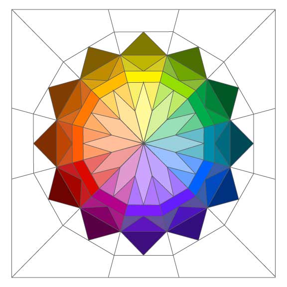
A Review: The color wheel is another invaluable tool when it comes to picking fabrics and combining colors. Here’s some quick basics:

Primary Colors: Red, Yellow and Blue

Secondary Colors: Two primary colors mixed together: Green, Purple, Orange

Tertiary (Intermediate) Colors: One primary and one Secondary colors
mixed together: Red-orange, Yellow-Orange, Yellow-Green, Blue-Green,
Blue-Violet, Red-Violet

Warm (Aggressive) Colors: Yellow to Re-Violet

Cool (Receding) Colors: Yellow-Green to Violet

Other Terminology:
Hue simply means Color.
Value: lightness or darkness of a color. The center is the darkest values, going lighter as it goes out.

Tint: Color + White (lighter color or low value – what a lot of people have been referring to as low volume.)
Tone: Color + Grey
Shade: Color + Black (darker color)
Key Color: the dominant color in a color scheme
Intensity: the brightness or dullness of a color.
That’s the basics of color. Now lets talk about combing colors.
Color Schemes:
I think it’s fun to combine colors and come up with different color
combinations. Sometimes they turn out awesome, and often times they
aren’t so good. Leaving it up to trial and error can be risky business
when you are using your precious fabrics. Here are the most basic color
schemes that in general, are pretty fool proof:
Monochromatic: A combination of Hue, Tint, Tone, or Shade of one color.

Complementary: Two colors that are opposite on the color wheel. (red, green. Can you say Christmas??)

Split Complementary: Pick a color and the two colors that are on either side of it’s compliment. (yellow, red-violet, green)

Triad: Three colors that are equally spaced on the color wheel. (Red-violet, yellow-orange, blue-green)

These are the basic rules of creating these different color schemes. You can apply them to any key color.
OR come up with color schemes the easy way! Use Design seed
(the link actually goes to Pinterest, I searched Design Seed. I like
looking at them on there because it’s easy to save the ones I like), or
other sites where you can upload your own photos to find a color scheme
(there are quite a few websites and I don’t know which is best, simply
google “color scheme from photo upload” and you should be able to find
some good ones. Which do you like?)
The Point:
The purpose in going over all of this is to make you aware of one important thing: The illusion of color.
Which is:
No matter what your key color is, placing it next to different colors, will change the appearance of that color. The color(s) you use in combination with your key color, can do a multiple of things to your key color. They can make it brighter and POP, make it dull (giving it a flat appearance), make it recede, make it mucky, or make it bold, even make it look more saturated than it really is.
What does that even mean??? (Don’t take offense by my following analogy)
If you take a super model and place her in a classroom of computer
science students, that super model is going to stick out like a sore
thumb. She is going to shine and glow and be the focus of the classroom.
She will POP. That is what happens to your favorite fabric(s) when you
combine them with contrasting fabrics. (The most extreme contrasts will
come with different values of contrasting colors.)
If you take that same supermodel and place her in a room full of
supermodels, even though she may be beautiful, she is going to become
just one of the crowd. She won’t stand out any more than anyone else in
the room. The room becomes flat. That is what happens when you throw
that key print in a combination of fabrics that, although stunning on
their own, are the same in value and/or warm/coolness on the color
wheel.
Mix your supermodel fabrics with some computer science student fabrics
(I’m not talking about ugly fabrics. I’m talking about contrasting
fabrics) = Your design will stand out and be a strong design.
Mix supermodels with supermodels, or computer science student fabrics
with computer science student fabrics = Your design will be soft and get
lost.
Neither is wrong. It’s your quilt! I just want to help you do it on purpose!
Examples:
I think the easiest way to learn is by example.
First of all, I created a Pintrest board
with examples of strong contrasts in design, as well as some different
color schemes, and a few pictures that have a mix of strong contrasting
colors and prints as well as some that aren’t so strong. None of them
are wrong. But they are different. Look at the different examples and
see if you can figure out the color schemes used, notice the contrast in
value, how they use tints and shades of a color to create contrast,
etc. Decide what you like, and what you don’t so you can mimic that in
your own quilt.
Second, here are two examples of my own, where I wanted a design to be
strong, but it ended up being flat and soft. The design itself got lost
in the fabrics.
Here is the design I wanted to make:

The fabrics I pulled for the project. I love these fabrics together!

Here is how my project turned out.

To me, it’s flat, the design is bland and doesn’t pop. Part of the
issue is probably the placement of my fabrics, as well as the pattern.
This stack could probably work wonderfully with a different pattern. OR
with the addition of some neutrals to break up the fabrics. Isolating
the fabrics, or substituting a few prints with neutrals that create a
more distinctive background or foreground, will help them shine better.
Now what I’m attempting to do, is make it pop with my quilting. I am
not finished yet, so we’ll see if I can save this. But until then, I’m a
bit bummed about it.
A second example: My 60’s Granny Quilt. I created a Giant Granny Quilt a
few years ago and love it! Here I am attempting to enlarge the idea
into one giant, scrappy, granny square that will finish as a 60″ x 60″
quilt. I love the colors together. They remind me of Starburst candy.
My stacks of fabric were fabulous and appeared to have enough contrast,
but in the following picture, the pink and orange do not contrast much.

So, what is the problem? The colors are different, but the scrappy mix
of value is pretty even throughout. An easy way to check the value of
your fabric is to change the picture to black and white:

See how you can’t even tell the difference between the orange and pink squares? They are exactly the same!
Do you also notice how the teal Simple Star block is also the same value
in the black and white picture? BUT in the colored picture it has a
strong contrast? Your values CAN be the same for a fabric combination to
work. What the difference is here, is that the pink and orange are both
warm colors, next to each other on the color wheel. The teal is a cool
color, opposite on the color wheel. If you use all warm colors, you need
the variations of value and intensity to help you out. If you have a
stronger contrast in color (warm vs cool) value doesn’t necessarily
matter as much, though it will still do a lot to add interest. See my
mock up examples below where I’ve added variation in value to add depth
to the designs.
These are using a Triadic color scheme: Green, Purple, Orange. The
images on the left are all the same value, no variation. The images on
the right have lighter values mixed in. See how it changes the
appearance of the block?


Do It on Purpose!
The Celestial Star block is a pattern where the designs are limitless
and can be quite striking. But they can also easily get lost when these
certain elements aren’t given enough attention. If you want your design
to stand out and be noticeable, do it on purpose! If you want your
design to be soft and muted, do it on purpose!
On Wednesday I will take this a
step further and talk about how this applies to fabrics, because for
myself, when color is applied to fabric it is an entirely different
language. 🙂
How was that for a novel of
information??? 😉 I hope it is helpful! The more I quilt the more I
realize how important this information actually is. I can’t wait to see
what you come up with!


