This post is part of the River Pond Quilt Along. You can find more info and the schedule HERE. While this content is directed toward the River Pond QAL, the same concepts can be applied to any quilt that you are making.
You can purchase the River Pond pattern HERE.
Homework Check-in
Yep, that’s right. I’m following up on your homework assignment.
I’m not one of those teachers who gives an assignment only to have it forever be forgotten. I don’t believe in busy work, so if I invite you to do something, it’s for a good reason. 🙂
So let’s check-in! Did you do it? (Did you miss it? You can find the assignment at the end of THIS POST.)
What did you come up with? Did you learn anything new about your likes? Did you simply throw a bunch of quilts into a board and call it good?
If so, that’s fine. But I’m going to ask you to dig a little deeper. Thinking about your River Pond quilt, find a quilt, or even just an inspirational photo – it doesn’t have to be of a quilt, that is a good representation of what you envision for your River Pond quilt – the colors, the overall feel, etc . Then be specific about what colors are in the photo, pull 2 or 3 bold main colors, a few more supportive colors, and a neutral (this doesn’t have to be white, grey or black. It could be yellow or pink! it’s for the background). You can use a few photos to draw the colors from, but make sure the photos are cohesive so you know that the colors will indeed look good together.
Once you’ve figured out the colors you want to use, notice how much of each color is represented in the inspiration photo. Because one big blob of color is not the same as small bits of color over the entire quilt.
Here is the link and a screenshot of a portion of my Pinterest board. I learned that you can organize your boards (I obviously haven’t been on Pinterest much in a loooong time actually), so I created a Color section to show some quilts where the colors are what draw me to it.
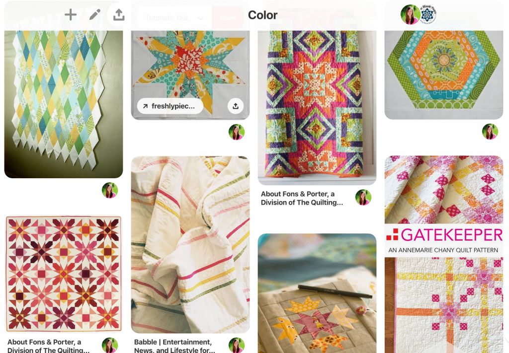
I really love the blue-greens and the splashes of oranges and magentas. I love contrast – in color as well as in design, making the designs pop rather than disappear in a wash of color(s). I also like the contrast of a stark background.
To go a little deeper, and what I am hoping that you can see in your order board or collection of favorite quilts, is a few key concepts that make those quilts your favorite vs other quilts that have many similarities, but didn’t make the cut.
Let’s analyze…
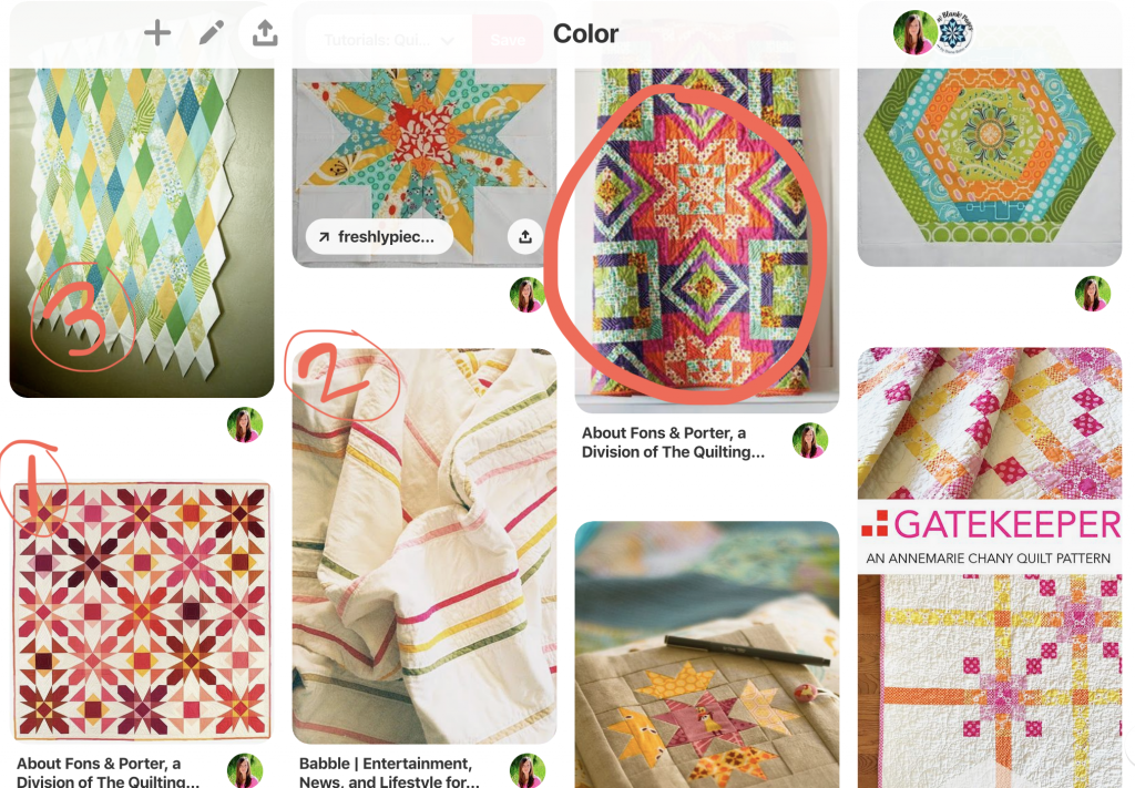
I’m going to compare all my comments with the circled quilt (3rd from left on the top). I really like this quilt, but for this discussion it’s going to be the “black sheep” of these quilts.
To break down specific things I want to discuss, I’ve numbered the comparing quilts in order from 1-3.
1. Both quilts are pretty busy, with little background space and not really anywhere to rest your eye.
What I prefer about 1 is that there is an obvious background fabric – the cream. This creates strong design elements of both of the star patters that emerge (kind of like the the image of the young women and the old woman – my eyes go back and forth seeing the more prominent bold design and then the other softer design).
I like the difference in hue and value that adds interest as well as depth to the quilt. (click over to my board to see it larger)
To compare to the circled quilt, I can’t decide if the purple or the green is the neutral/background color, though I think it’s the purple, my eyes keep wanting to be the green. Either way, it leaves me with a feeling of confusion rather than resting.
It does have contrast in hue and value of the magenta/oranges, but the strong colors and values are so similar to the purple and green that the detail of the design gets lost and aren’t as prominent as the 1 quilt – though this might not be entirely true if we could see the entire quilt and not just a portion of it.
Time Out!
I feel like I sound critical – I’m not. I love the quilt. I’m just using my college art classes critiquing background to point out some design elements – things to take into consideration when planning your own quilts. 😉
“Wait a minute… I thought this was a quilt along. Why are we suddenly in a college art class?? Why are we even talking about this stuff???”
Can I tell you why?…
Because in my opinion, the planning stage is the most important part of the quilting process. As in any process, a clear plan from the beginning ensures a quality finish. Which can often include tweaking along the way, of course. You don’t have to agree, but I invite you to try it out. 👍
One of the biggest hurdles that I hear that people have when it comes to stepping away from the “cookie cutter” quilt making style (cookie cutter as in a designer makes Quilt C and you everyone buys the exact same fabric colors, and makes the exact same quilt, and suddenly there are 100 Quilt Cs. Like a cookie cutter – they all turn out the same. Which is 100% AWESOME and an absolutely AWESOME part of buying a quilt pattern! You know exactly what you’re going to get! (don’t let my text give you the wrong impression. If you could hear the intonation of my words, you’d hear that I have zero criticism in my voice. 🙂 Just so that’s clear.)
Except that I do NOT make cookie cutter patterns. I do not intend for anyone to make their quilts exactly like I do. I’m flattered and honored when people do, but I LOVE when people add their own creativity, style, spin, whatever onto my patterns and make finished products that shine they way the way the individual does! 😀 I realize this is not the norm in the quilting world, but hey, that’s who I am. 🙂
Anyway… so the biggest hurdle I hear is that people struggle with stepping outside the box and knowing what fabrics will go with what, and how to combine it all together. Thus, we are here discussing this.
And… a quick story. When I first started quilting and designing patterns I got SUPER excited about all the different designs I could find in a pattern and I would create the quilt trying to emphasize ALL the different designs and elements and you know what?? It NEVER WORKED! The quilts are fine, but they aren’t awesome like I wanted them to be. Over the years I’ve had to learn how to step back and focus on one element at a time, make my quilts simpler, be more aware of how the fabrics I choose play in the quilt – because fabrics can really mess you up if you pick the wrong ones. Anyway… so paying attention to how other people play with color, design, and put it all together, or how they leave it all out, will help you begin to train your eye to see what’s going on and know how to create the quilts you want to create!
Some people are naturals at this, but it’s not anything that the rest of us can’t learn. It just takes knowledge and practice.
now enough rambling already… you ready??!
“Yeah, that makes sense. I guess. When do we quilt?”
Hang on… just a little bit more discussion first.
2. The second quilt has the colors but WAAAAY more neutral/background fabric. It’s crisp, clean and classy. I LOVE the simplicity though it makes a bold statement. I love design way too much and have never made a quilt this simple, because like I mentioned above I struggle with keeping it simple, but I DO love this! I’ll have to force myself one day. 🙂
3. I want to point out this third quilt because it doesn’t have all the colors, it’s more cool (no oranges or pinks), mostly greens and yellows, but it still has so much depth and movement to it! There are so many different ways to emphasize a design and value contrast (value is the lightness or darkness of a color, so value contrast would be lighter values against darker values) is one of the BEST ways to accomplish this.
To test this out, look at the two single block photos on the top row and squint your eyes almost all the way. Both blocks have different colors that contrast, but when you squint it all turns into the same. You could also test this by changing them to black and white. I bet you wouldn’t be able to tell where the different colors are because they are all basically the same value. Yep, even that yellow in the block on the left. It’s crazy how many yellows I’ve laid out to test the value with a black and white picture and they look way darker in greyscale than what you’d think. The block on the right actually does have some contrast if you click through and look at the larger picture, but still not a lot.
Do this same thing with quilt 3 (squint at it) and see the difference how the darker valued diamonds really show up and the lighter value diamonds disappear? This is an awesome example of using different values.
Check out the From Blank Pages Community group to see other people’s boards, and share your own!
So What does this have to do with the River Pond QAL?
The purpose of all that is to open your eyes a little as you start to plan your River Pond quilt!
You might already know exactly what colors you want to use and where you’ll put them, you might already have your fabrics picked out, but I STILL want you to do this next assignment! Even if you didn’t do the first assignment of curating and analyzing a bunch of quilts that you love.
BUT… since this post is already so long, I’m going to ask that for tonight, let these concepts mull over in your mind for a bit and then I’ll have the next post and assignment up first thing in the morning. Cool?! I don’t want to overwhelm you.
Homework
Take a few moments and look back over your collection of quilts, whether on Pinterest, or a saved collection on Instagram, or magazine clippings, wherever. Try and find different elements of the quilts and compare them with other similar or different quilts.
Pay attention to:
Color: how many colors are there? warm colors? cool colors? a mix?
Value: are they all very similar in value? or is there a big contrast? how many different values are represented?
Placement: how are the colors and values placed in conjunction with each other? are similar colors/values next to each other? or is there a lot of background fabric between them?
If you’re feeling overwhelmed or confused, I’ll talk about this just a little bit more tomorrow. Just remember to HAVE FUN! Pretend you are the Sherlock Holmes of quilting and you are on a quest to explore quilts. Haha! There are no wrong answers. And what you like about one quilt and what you don’t like about another quilt is almost guaranteed to be different than someone else. And that’s exactly how it’s supposed to be! Because you aren’t someone else. You’re YOU! And we’re here to find what YOU like. <3
See you tomorrow!
Ps. leave a comment and tell me what you think! Or bring the conversation over to the Facebook group and see how others weigh in on the conversation.