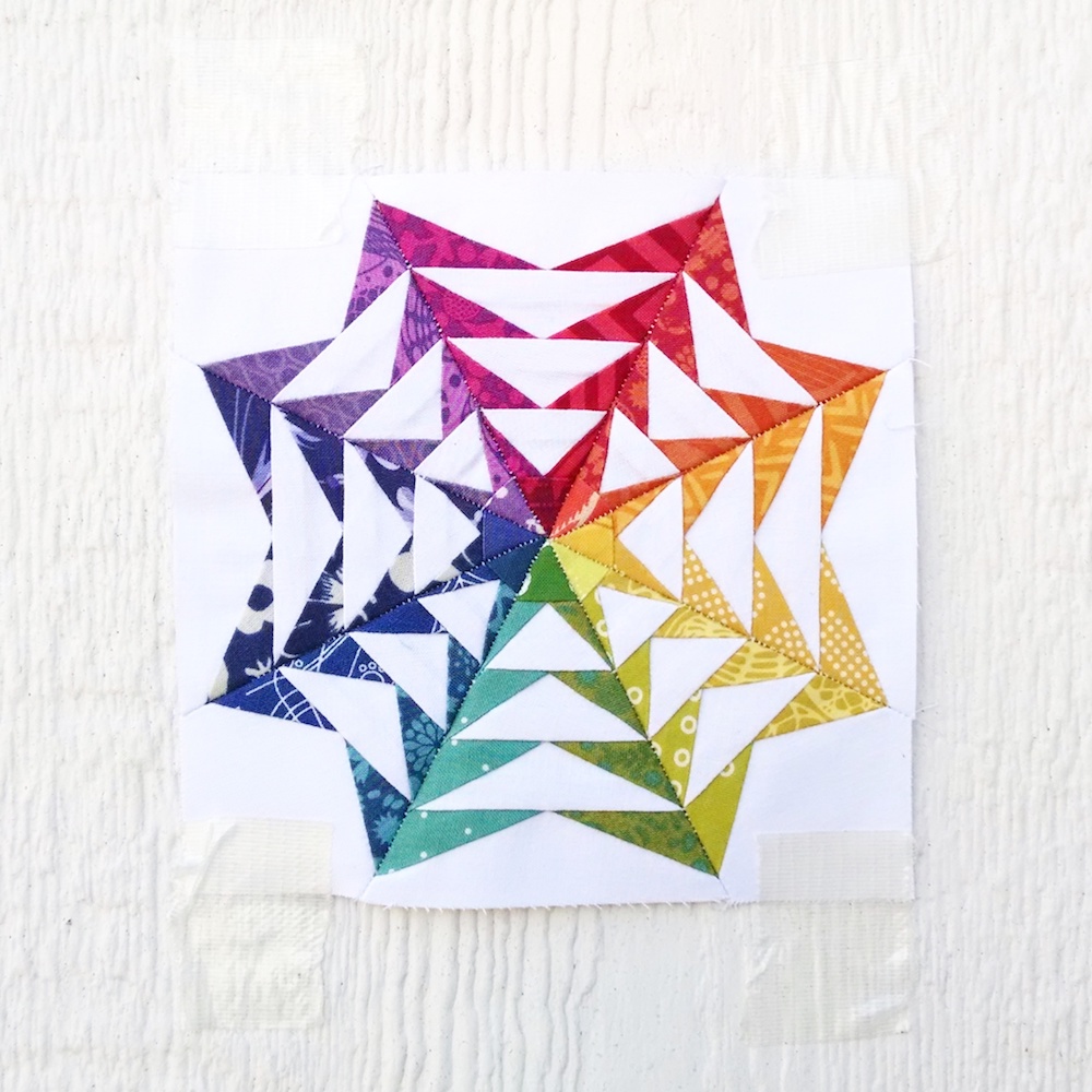
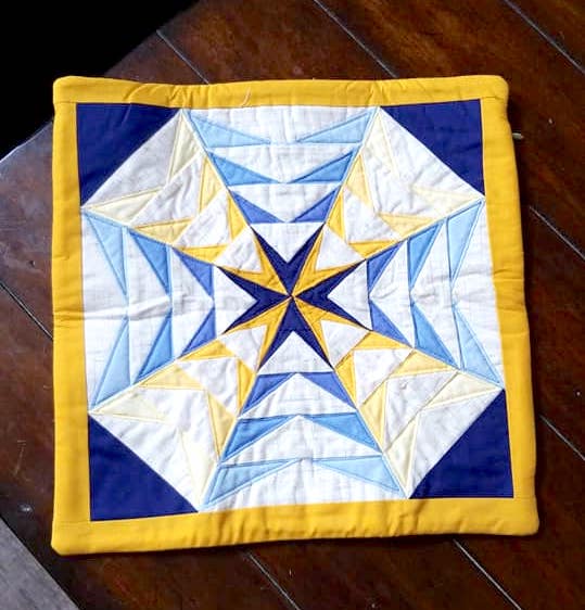
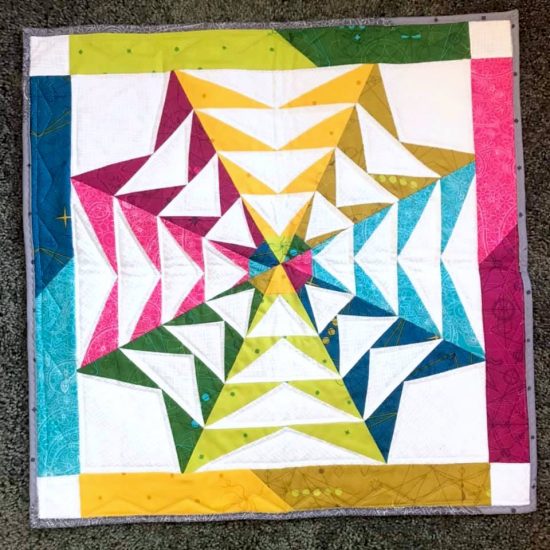
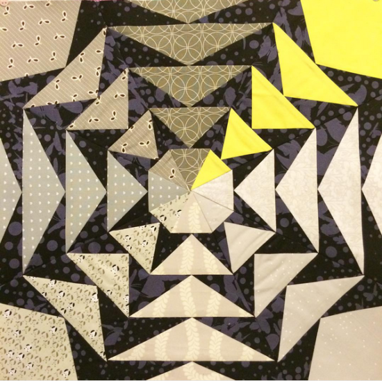
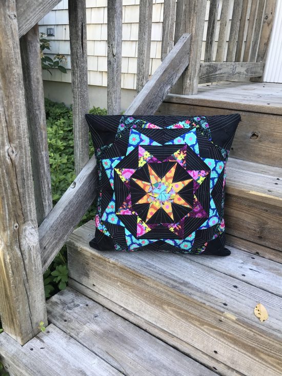
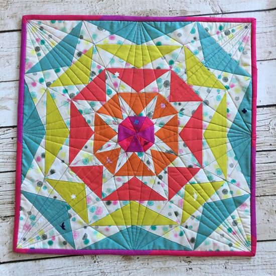
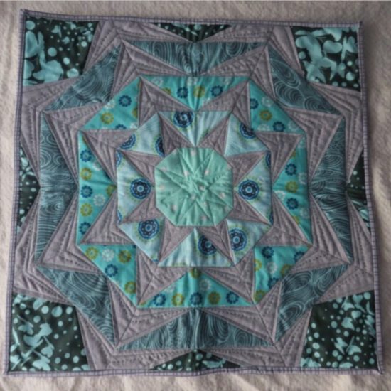
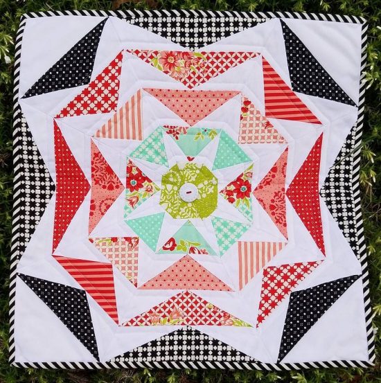
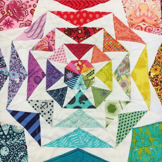
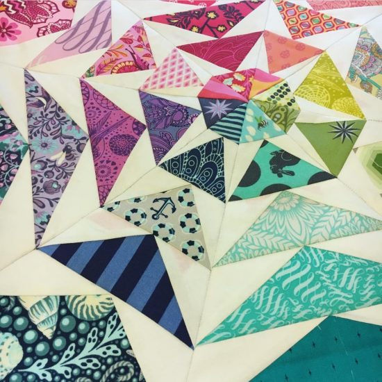
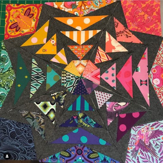
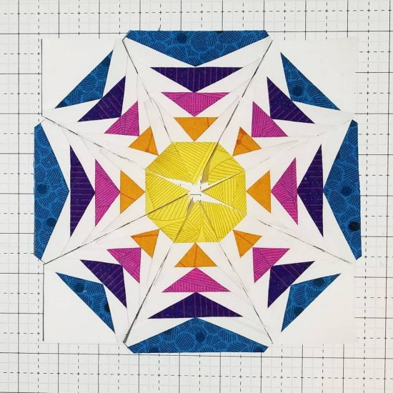


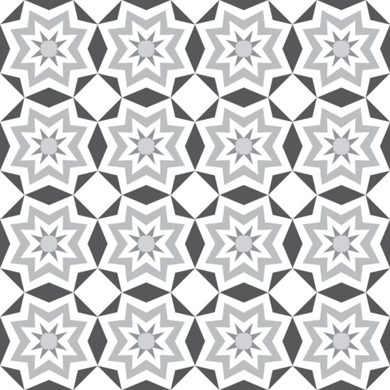


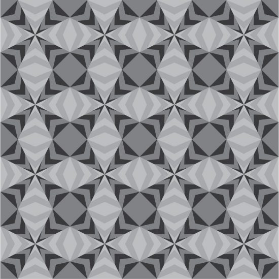


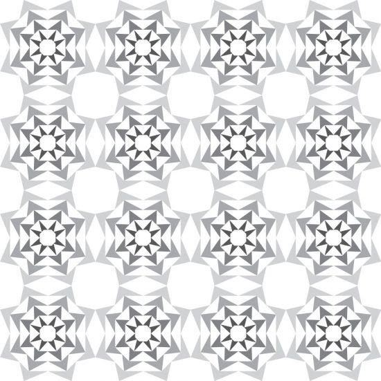

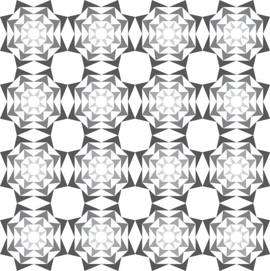


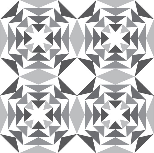

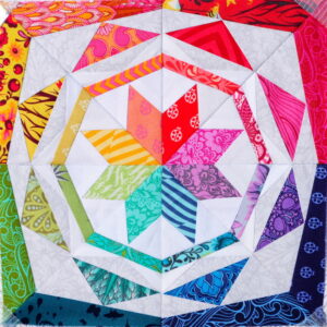
Simple Celestial
Meet Simple Celestial: If you’re familiar with my Celestial Star pattern, you’ll recognize that Simple Celestial has the same design
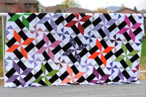
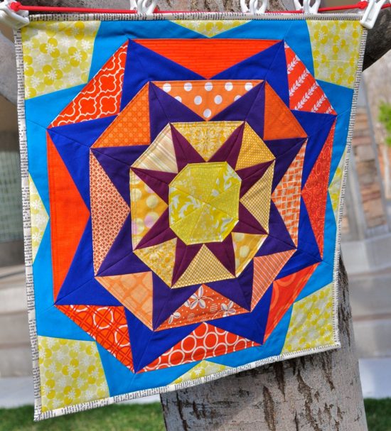
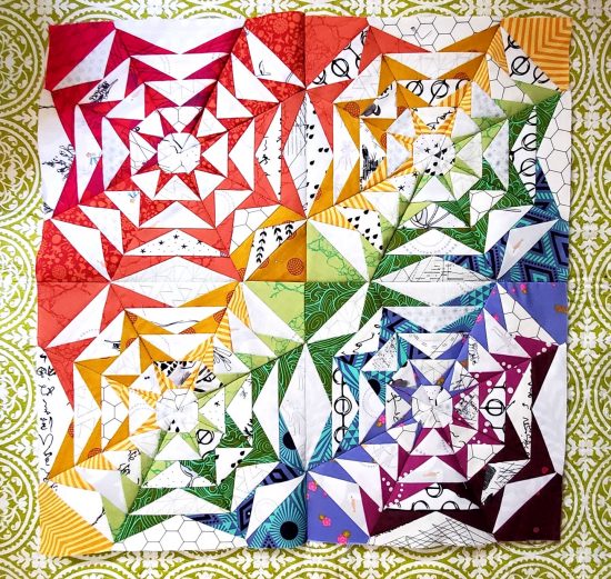
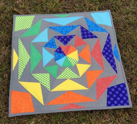
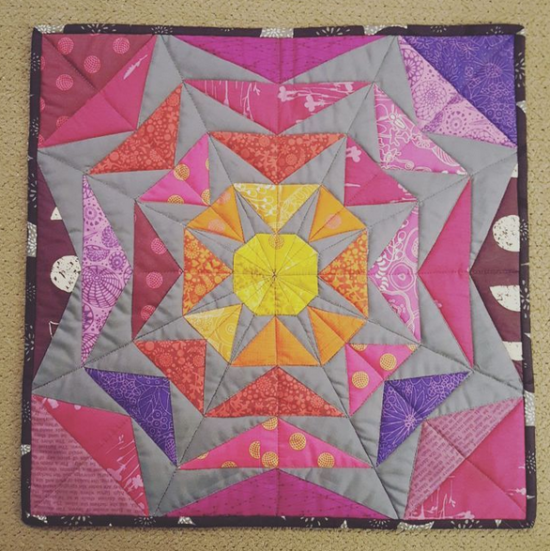
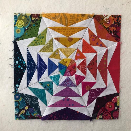
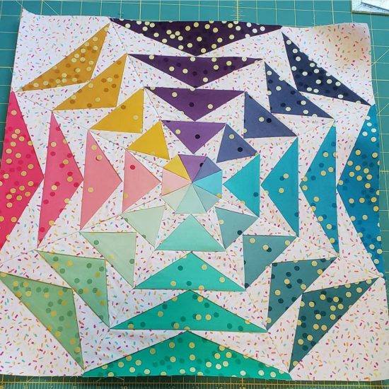
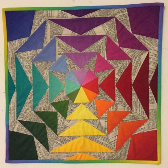
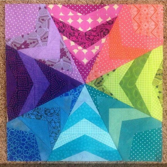
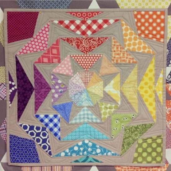
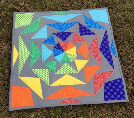
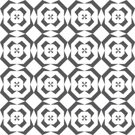
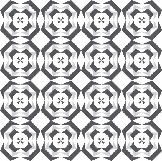
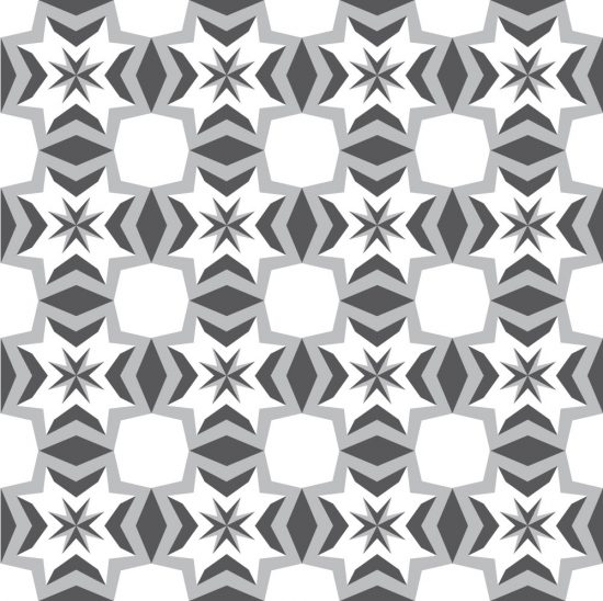
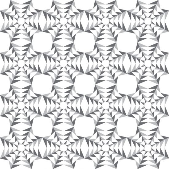
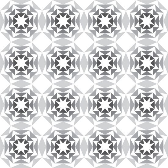
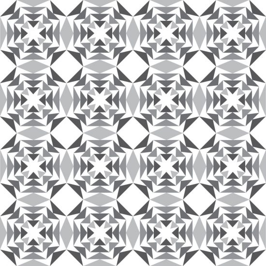
Starry Skyline
Meet Starry Skyline: Starry Skyline is a pattern that I created years ago for a Quilting Bee I was in
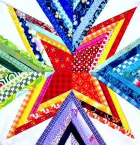
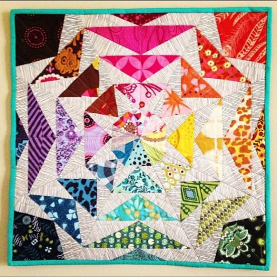
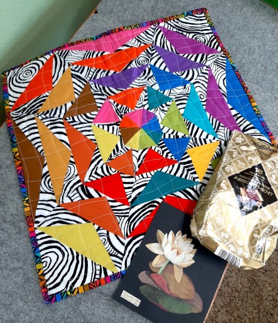
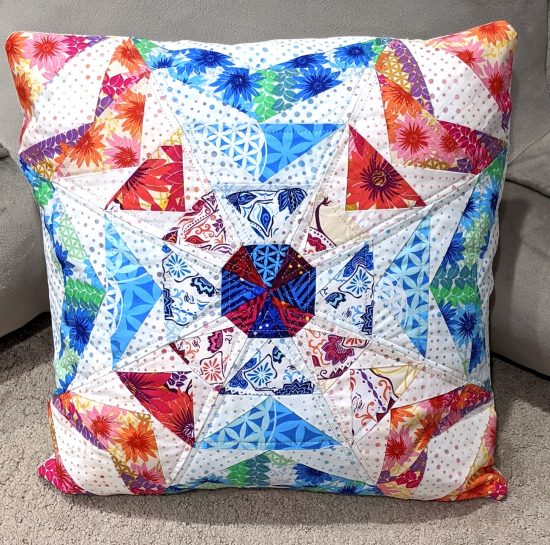
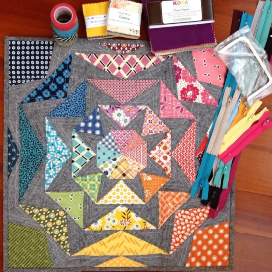
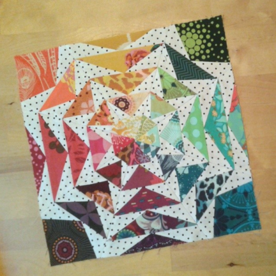
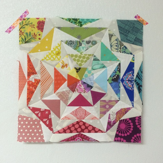
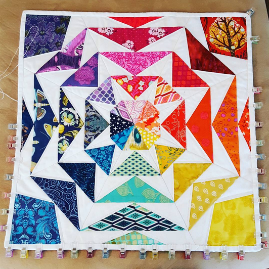
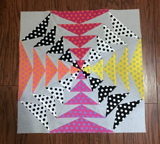
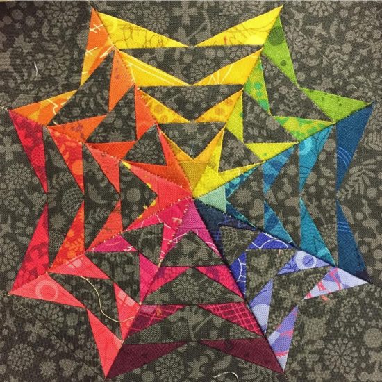
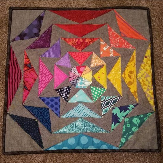
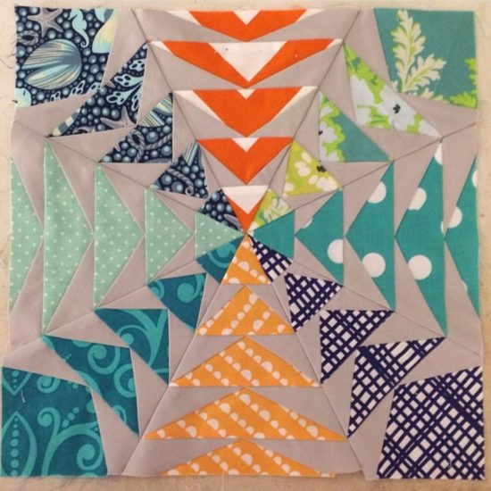
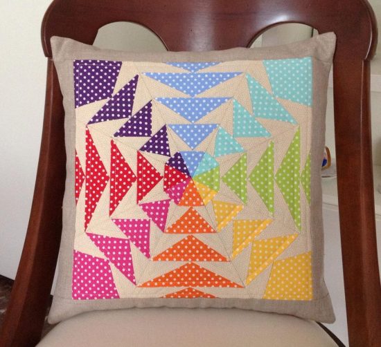
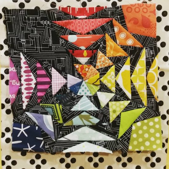
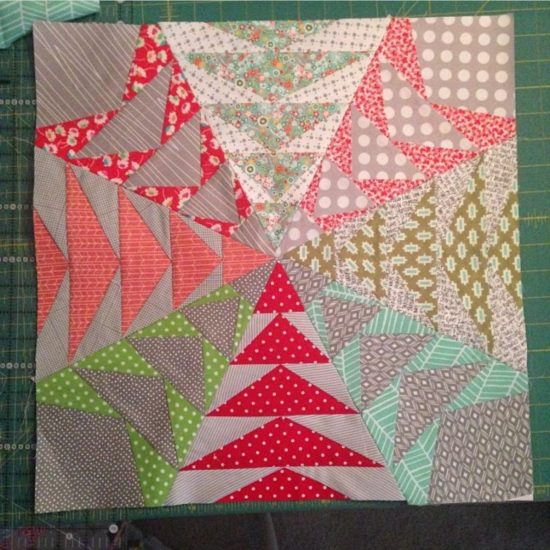
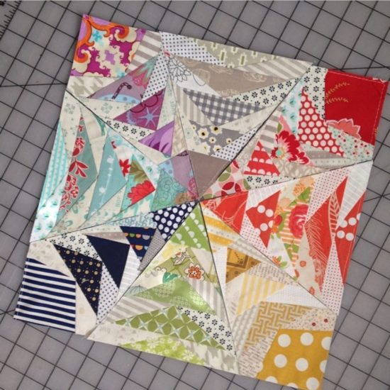
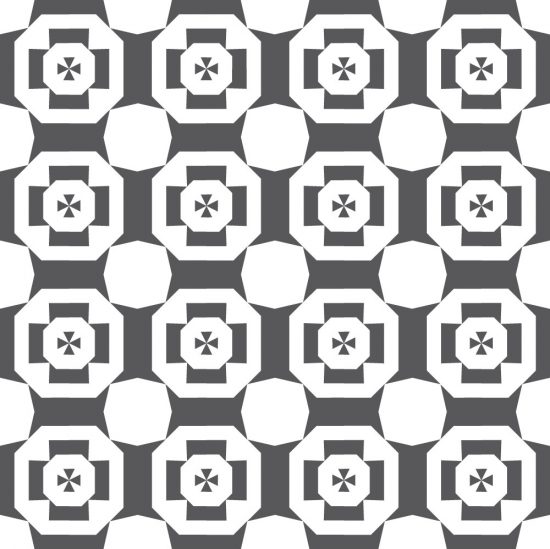
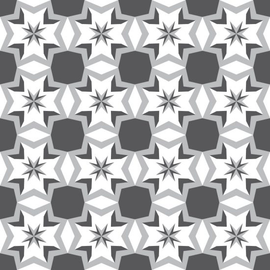
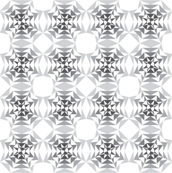
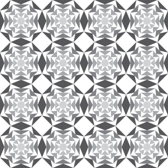
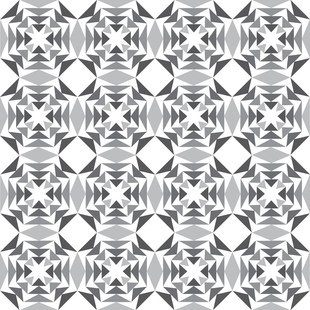
Scrap Attack
Meet Scrap Attack: Scrap Attack is where all of this started!! It is my very first pattern I ever created,